
Color Matters

When it comes to shooting film, I’ve always preferred black and white to color. But lately I’ve been really inspired by the works of Greg Miller and my friend Holly Kerchner, both of whom shoot primarily Kodak Portra 800. So I decided to give it a go and shot eight rolls of Portra 400 over the last three weeks. It was my first time using this film, and I took it everywhere from the city of Orlando to the wilderness of the Ocala National Forest and to the pristine beaches of Florida’s gulf coast. I want to share with you some of the images I made as well as my initial impressions of Portra 400 and some thoughts I have regarding shooting color film in general. Enjoy!
A teeny bit of background info
When I was 15 years old, my mom enrolled me in a basic film photography class. It was my first real experience with both film photography and photography in general.
When I was 18, I needed to take one more class to fill up my first semester of college. So I signed up for a film photography class. This is when I became serious about film photography. Most of what I shot at the time was black and white, but I did shoot a bit of color with my Holga 120N. I was really into the super saturated effects of cross-processing E6 slide film in C-41.
So my experiences with film have always been predominantly black and white. And even when I did shoot color, it was only to achieve weird effects.
My thoughts on black and white VS color
I feel that a lot of people see black and white film as an “artsy” film. Like everything that is shot with black and white is instantly cooler or something. I couldn’t disagree more.
I like black and white because it captures the raw essence of the moment. When you remove color from the equation, there are no distractions. The moment becomes the subject of the image, and it’s either a good one or it isn’t.
Now obviously most of us experience the world in color. So it makes sense to shoot in color. However, I don’t think people put enough thought into shooting in color. My belief is that when you’re shooting color, then color matters. It can't just be an afterthought. Color adds another layer of information to the image. So when you use it, you need to be even more careful of how you are organizing that information. It can quickly turn a simple moment into a busy and difficult-to-digest image.
During these past three weeks, I found that my entire approach to photography changed. Sure, I still looked for those candid little slices of life (my background is in photojournalism, after all). But I found myself looking more for colors and shooting scenes that I wouldn’t otherwise notice when shooting black and white. It’s like an entirely new world opened up.
For example, this image of a red car with a man in a red shirt riding his bicycle in the background is admittedly a boring scene. There’s not really a whole lot going on, and I would never have taken this picture if I had been shooting black and white. However, the repetition of the red car and the red shirt adds a little bit of interesting information to this image. And then the contrast of the red with the little bit of green palm in the upper right corner of the frame adds even a little more interesting information. I still don’t think it’s a great shot, but it’s a good example of the power color plays in photography. It has the ability to take an otherwise boring scene and give it a little bit of interest.

One thing that’s always held me back from shooting color film is the lack of control. With black and white, I control everything from the shooting to the processing to the scanning. I can control how much contrast the negatives will have based on what developer I am using and how many times I agitate the film during processing. Black and white film is also very forgiving when it comes to chemical temperatures.
But with color film, I don’t have that sense of control. Now don’t get me wrong, there are kits out there that would allow me to process my own color film. And I completely intend on trying these out in the near future and posting my results. But I still don’t feel they offer the same level of control. But again, I've never tried these methods, so I can't really back this up.
Images
I shot all these images with a Leica M6 paired with a Zeiss 35mm f/2.8 Biogon. I had the negatives processed at Colonial Photo & Hobby here in Orlando and scanned them myself using a Plustek OpticFilm 8100. All post work was done in Adobe Lightroom and is very minimal. It primarily consists of cropping out the border and removing any remaining color cast from the scans.
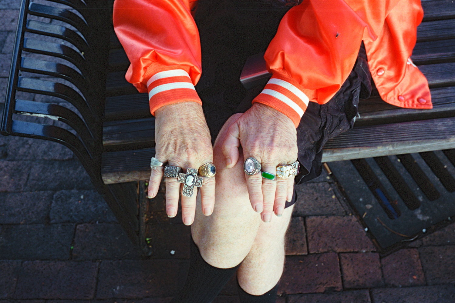
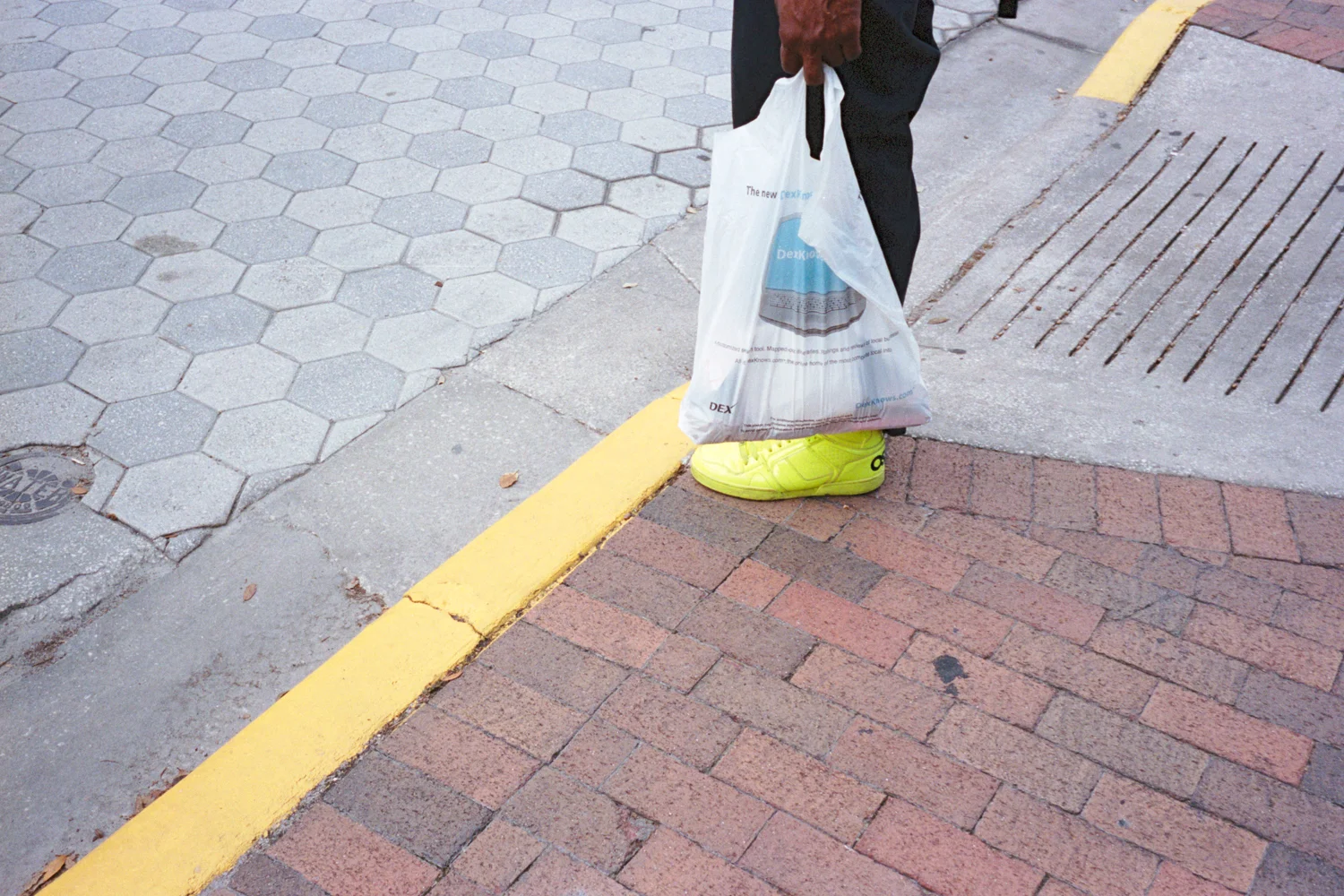
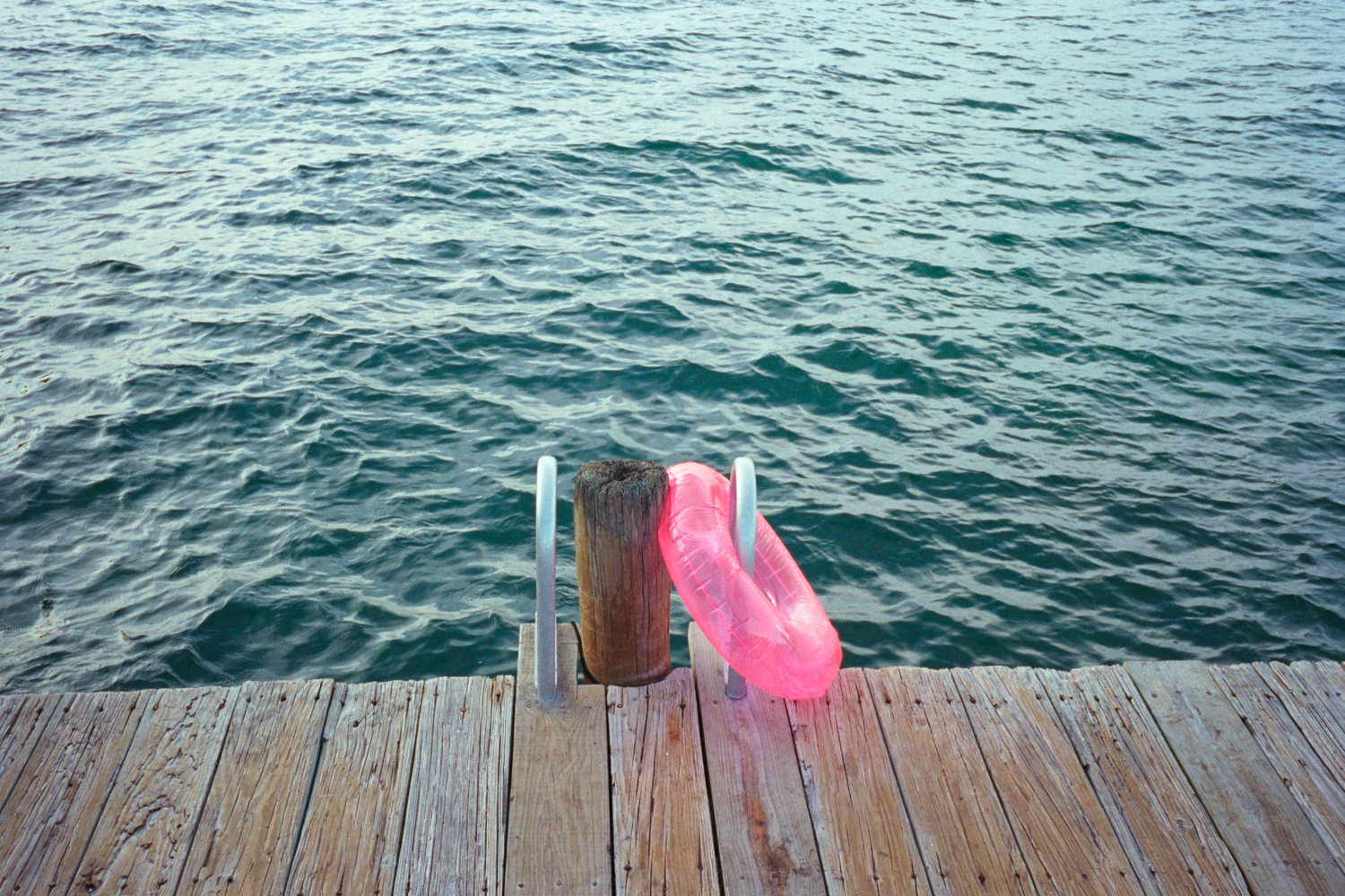
So without further ado, here are some of the images from those eight rolls. Obviously this is only a small selection, but I wanted to just post a few that work well together and demonstrate a broad range of the situations I photographed with this film. If you wish to see more of the street work, I’ll be posting some things to my Instagram as well.


Final thoughts
Overall, I am very pleased with the results. Portra 400 does a really nice job rendering skin tones (hence the name). I found my best color results were in images taken when the lighting was very soft, such as during an overcast sky or just after the sun had set. But I guess that’s true across all photography.
I hope you enjoyed this post and hopefully it inspires you to go load up some Kodak Portra. If you have any suggestions or comments regarding best practices for shooting, processing and scanning color film, I’d love to hear them in the comments below!
Happy shooting as always,
Matt